Monday, 2 May 2016
Tuesday, 22 March 2016
Entry 6:
Today 3 members of our group, James, Ghanshyam & Thomas, went up to London, Southbank, to film our establishing shots of the iconic landmarks. Shooting went well, the weather was perfect and so was the lighting. We managed to film the majority of the shots on our storyboard with relative ease. Some of the shots came out blurry but we made sure that we filmed each shot at least 2/3 times.
There was one issue with the Houses of Parliament show however. We didn't know beforehand that there was construction work on the Houses of Parliament. This meant that we couldn't get the shot we wanted to get originally and meant we had to improvise and change the shot when we got there. We weren't able to find out when this construction was due to be finished so we will have to go back at a later date and re-film the shot regardless. We managed to film in all the locations we wanted to including; the Houses of Parliament, Mi6 building and the River Thames. We also filmed our time lapse shot in Trafalgar Square with relative ease.
Entry 5:
On the 16th of February in half term our group has planned to go up to London in order to take pictures of our locations and start filming for our title sequence. We will film our establishing shots which open our sequence. The locations we will go to in order to film these are: Vauxhall Bridge (MI6 building), Houses of Parliament, Big Ben and the London Eye. There may be other places where we decide to get a shot of during the time we are there but the places stated are locations we will almost definitely visit.
Mission Impossible 4 - Title Sequence Analysis
LINK HERE:
This sequence is very fast paced and takes on the perspective of a fuse. The audience is put in a position where they are almost following the fuse and it takes them through a lot of key scenes from the film itself. The fuse itself is key iconography as it connotes explosions and danger or violence. These elements are all extremely common in spy and action films.
During the sequence there is also a car chase. Again this is typical of an action/spy film and is key iconography which is used effectively as the audience instantly recognises this and associates the film with the genre. This also helps them to know the sort of theme that the film will follow and what the action will be like throughout the film.
All of this is accompanied by a very generic soundtrack which has also become extremely recognisable with this genre. It is very dramatic which suits the fast pace.
This film is also a spy film which fits into the genre my group chose for our title sequence. The sequence shows off some of the key iconography and codes and conventions of this genre.
Thursday, 17 March 2016
Entry 4:
FONT DESIGN RESEARCH & PREPARATION:
Today we begun to research into different typographies; here are some we discovered that we are all particularly fond of - all have been sourced from www.DaFont.com.
In spite of today's research, we are still continuing to look. The font choice is significant to us because it is one of the most crucial pieces of iconography within our sequence, we feel it necessary to perfect. Whilst these fonts are all good to differing degrees, they all lack the significant aspect that we are seeking, which is why we are continuing our research.
Friday, 11 March 2016
Entry 3:
Thursday, 10 March 2016
THINGS TO BLOG:
Organise title sequence designers into 'research and planning' - finish them
Write up analysis of Skyfall title sequence
Do lots more journal posts (location scouting, prop acquiring, (the wall) editing sessions, group feedback, soundtrack options pre-filming, first edit) - include any issues we faced and how we overcame them, the broken tripod the group used when they went up filming and the instability of shots. Font choice and questionaires.
RESEARCH SAUL BASS
Entry 5:
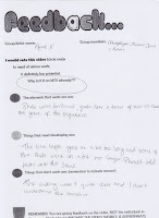
FIRST EDIT FEEDBACK:
Today we pitched the first edit for our title sequence: we did this to gain critique from the rest of the class and, more importantly, our two media teachers. Pitching has enabled us to gain greater understanding of how to develop our sequence and how to elevate it to a higher standard ahead of the deadline for it.
Friday, 4 March 2016
James Bond: 'Skyfall' (2012) Title Sequence Analysis
SPY GENRE TITLE SEQUENCE ANALYSIS (#1)
Consistently throughout this title sequence a slow, fluid-like pace is present; this is depicted primarily through use of black fade and dissolve effects via editing. Effects such as these enable connotations of surrealism to be provoked from the audience - particularly the dissolve effects, which are conventional within films which show conformity to the fantasy genre, 'Star Wars: The Force Awakens' (2015) for instance. Additionally, the dissolve effects comprise in the creation of the fluid-like atmosphere that the sequence has too: the whole concept of fluid-ness also links directly to the idea of as spectators witnessing everything in this sequence happening from underwater.
Sound only constitutes further in the construction of the pace within this sequence; no other sound has been implemented, besides the accompanying orchestral soundtrack. Essentially, the title sequence is a music video too, however, the overlaying white title texts are what distinguish it as a title sequence.
This title sequence is reflective of the horror genre
Reflective of grittiness, gore, abnormality, (mise-en-scene)
Editing effects enhance this whilst conjunctively paralleling with the use of sound.
Consistent close-ups to stabilise audience's attention
Negative connotations via mise-en-scene
Text is untidily placed, distorted,
s
strict use of colouring
TITLE SEQUENCES TO ANALYSE: (30-40 - OUTSIDE GENRE)
-SE7EN
-THE INCREDIBLES
-THE INCREDIBLE HULK
-HARRY POTTER(S)
-CATCH ME IF YOU CAN
-JAMES BOND - SKYFALL
-JAMES BOND - CASIONO ROYALE
-JAMES BOND - QUANTOM OF SOLACE
-JAMES BOND - SPECTRE
-DJANGO UNCHAINED
-SCOTT PILGRIM VS THE WORLD
-FIGHT CLUB
-JUNO
-SNATCH
-THE GIRL WITH THE DRAGON TATTOO
(IF THEY HAVE TITLE SEQUENCES)
- SHUTTER ISLAND
-DEPARTED
-CATCH ME IF YOU CAN
-BLOOD DIAMOND
-THE BIG SHORT
-HATEFUL 8
-GONE GIRL
-ARGO
-ROBOCOP
-DJANGO UNCHAINED
-HARRY POTTER
Saturday, 27 February 2016
Entry 2:
DESIGNING & FILMING THE WALL:
In our storyboard, we planned to film numerous shots of the antagonist building on his manhunt profile of the protagonist, Agent-X. In preparation for filming this, we started creating and organising the necessary props needed for the shots, for instance, the printed photos of Agent-X's associates, which we used to create the manhunt profile today. After the wall was configured, we then proceeded to filming our needed shots.
Here is evidence of our note board being configured:
Thursday, 25 February 2016
Karin Fong - Title Sequence Designer Research
Karin Fong is a title sequence designer who was conceived and grew up in Los Angeles, she began her career after having attained an art degree. She then joined the west coast studio of R/G/A before becoming a founding member and partner at Imaginary Forces.
Karin has created numerous title sequences for both film and television over the years, her most famous pieces being included in: 'Boardwalk Empire', (2014) 'Terminator: Salvation' , (2009) 'Charlotte's Web', (2006)and 'Rubicon' (2016). Her work has attained her five nominations and also on Emmy for title design. She has also constructed cinematics for the Sony Playstation game, 'God of War III' and large-scale video installations for sites such as Lincoln Centre, Las Vegas, ands the LA Opera.
Karin's work has appeared at the Cooper Hewitt National Design Museum, the Pasadena Museum of California Art, The Wexner Centre, Artists' Space and the Walker Art Centre.
Saul Bass - Title Sequence Designer Research
Saul Bass (1920-1996)
Who was he?
He started his career by designing posters with his ability of being able to capture the mood of a film by using simple images and shapes.
Often, these shapes used were hand drawn by Bass in order to create a more casual appearance. This was also usually accompanied by a sophisticated soundtrack.
Throughout his career he designed over 60 title sequences with his most famous including North by Northwest, Vertigo and Psycho.
He worked alongside Alfred Hitchcock a lot in his career with a good example being Vertigo.
His title sequences revolutionised the style in which we see them these days.
Who was he?
- An American graphic designer who became famous for his work in film.
- He studied design at Art Students League in Manhattan.
- Born in New York on May 8th 1920.
He started his career by designing posters with his ability of being able to capture the mood of a film by using simple images and shapes.
Often, these shapes used were hand drawn by Bass in order to create a more casual appearance. This was also usually accompanied by a sophisticated soundtrack.
Throughout his career he designed over 60 title sequences with his most famous including North by Northwest, Vertigo and Psycho.
He worked alongside Alfred Hitchcock a lot in his career with a good example being Vertigo.
His title sequences revolutionised the style in which we see them these days.
Entry 1:
STORYBOARDING:
During today's media lesson - after having produced our group's audience profile and film pitch - we began the construction of a storyboard for our title sequence assignment. Our storyboard is a basic sequential illustration of what we want/predict to film as footage for our title sequence within the next few days/weeks, essentially an organised plan.
Every member in our group contributed towards the creation of it and we ended up finalising it completely later the same day, again as a full group. We found ourselves particularly discussing how we wanted to employ the micro features - mainly cinematography and mise-en-scene - within our sequence and we ultimately prioritised this the most when creating it. I found myself playing a significant part in the discussion of this due to my broader knowledge of micro features having studied Film Studies at GCSE level, unlike the other members of my group.
Our storyboard shots took heavy inspiration from other relevant film texts within our focused genre, texts such as 'James Bond: Skyfall' (2012) for instance. We took inspiration from how effectively it used settings as iconography to communicate its genre, specifically the establishing-shots of iconic British landmarks within the disruption stage of the film, shots like where the M16 building is seen exploding through pyro-techniques.
Audience Profile
AUDIENCE PROFILE RESEARCH:
This is the audience profile I designed for my group's film production 'AGENT-X' (2016).
I designed this through use of Photoshop CS6 on my PC.
Wednesday, 24 February 2016
Journal
Here I will be recording all contributions me and my group make towards producing our 'AGENT-X' title sequence and how we overcome any issues/obstacles in the process:
Class Notes
TUESDAY 19TH JANUARY:
Genre and how it is defined through N.I.C.S (Narrative, Iconography, Characters and Setting)
ANALYSING GENRE WITHIN TEXTS:
Genre
N.I.C.S- Use to define genre
N- Narrative
I- Iconography (Visual elements which establish the genre)
C- Characters
S- Setting
Analysing genre:
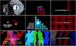
Dr.No
Action/spy film- silhouettes, gun barrel (iconography which establishes the genre). Features Sean Connery-most known for James Bond.
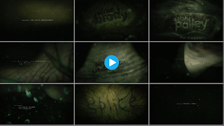
Splice
Sci-fi film, green colour scheme, consistent colour scheme throughout which gives off a skin/ alien effect on the audience.
The back up plan
Chick flick- bright colours. Hybrid: Romantic-Comedy (Rom-Com). Romance iconography- babies on TV. Comedy iconography- Flasher. This film is clearly targeted towards a female audience- elegant typography, animation, colour scheme.

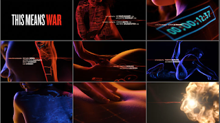
This means war
Rom-Com: references spy film. Uses intertextuality to reference a James Bond film.
Tuesday, 23 February 2016
Title Sequence Research
HISTORY AND PROGRESSION:
Prior to the invention of the cinematograph - a motion picture film camera and projector - in the 1890s, simple title cards were used instead to both begin and conclude silent film presentations to establish to an audience a film's title and the production company(s) involved in the practices of producing and distributing it. In silent cinema, title cards/intertiles were utilised throughout films' narratives to convey dialogue and plot, and it is in some of these early short films that we can see the first initial examples of title sequences themselves, being literally a sequential series of title cards shown at the beginning of a film. With arrival of sound, title sequences became usually accompanied with a musical prelude or overture. Contemporary title sequences have developed this technical convention and now typically establish leitmotif soundtracks within them.
Slowly, as time has progressed, title sequences have evolved and become more elaborate pieces of film within contemporary cinema. Title design saw a pivotal moment of development particularly during the 1950s consequential to the advent of television - which instigated a decline within the film industry - as it forced the 'big six' Hollywood conglomerates (Warner Bro Pictures, 20th Century Fox, Paramount Pictures, Walt Disney Studios, Columbia Pictures and Universal Studios) to all invest in new methods of making cinema more appealing again in attempt to rejuvenate it and recover a diminishing/dwindling audience.
PURPOSE BEHIND TITLE SEQUENCES:
- To commend the primary contributions made in the development process of a film production - conventionally done through editing and applying on-screen text.
- To further endorse actors'/actresses' star power and help develop their filmographies.
- To acquaint audiences instantly with the genre/hybrid-genre of a production - typically through simplistic use of iconography and mise-en-scene.
- To establish the relevant key themes, messages and values of a production's narrative.
- To immediately make attempt at engaging/immersing audience (pre-equilibrium) before the pace of the narrative begins to pick up - commonly done through strongly appealing aesthetics.
'AGENT-X' (2016) Pitch
This is the pitch for our British film production 'AGENT-X' (2016) that I produced for me and my group to present to our media class to promote the necessary funding to create it.
Research and Planning
Our group - after much discussion and dispute both in/out lesson - came to a unanimous agreement of selecting the 'Spy sub-genre' as the context for our title sequence assignment.
RESEARCH INTO THE SPY SUB-GENRE:
Spy genre films generally intertwine narrative elements from both the thriller and action genres - where it derived - and typically deal with the subjects of fictional espionage and organisational conspiracy, either in a realistic way (such as adaptations of John Le Carre) or as a basis for fantasy (the 'James Bond' film franchise: the most internationally respected within the genre. As time has progressed the genre has become a significant aspect of British cinema, with leading directors like Alfred Hitchcock and Carol Reed even making notable contributions with many of their films being set in the British Secret Service.
CODES & CONVENTIONS:
- Espionage.
- Good organisation devoted to stopping the evil one (binary opposition - conformity to Levi-Strauss' narrative theory)
- Exotic and exploratory depictions of culture/settings.
- Suave, sophisticated, well-dressed protagonists.
- A 'temptress' female/'femme fatale' who serves distraction to the protagonist, typically as a sub-plot.
- Possibly Propps' character role of a 'damsel in distress'; not particularly seen within this genre, conventionally more within action/action genre films.
- Manipulative antagonists (typically the heads of illicit organisations) who enact only for personal gain/interests (such as: authority, money or even ownership - connotations attributed to greed).
- Heavy use of gadgets and weaponry.
- Theft of documents/files/formula/technology - something good an antagonist can acquire and use as a force for evil.
- Henchman/personal bodyguards.
- Implausible life or death scenarios the protagonist is pitted against and escapes with ease.
- Realistic military themes.
- Chase sequences (foot and vehicular).
- Fight sequences.
- Pyro-techniques/explosions.
- Aristocratic figures.
Here are some examples of eminent iconography pertaining to the genre:
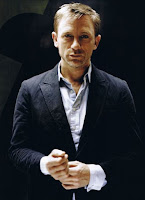 Suave, sophisticated dress-senses; generally used to enable protagonists to be distinguishable with ease from other characters. James Bond, (played by Daniel Craig) the eponymous protagonist of the British film franchise - 'James Bond' is an archetype of this. As an audience, we rarely ever see him dressed outside this particular dress-sense, for instance, in more casual wear: his style is not flamboyant, however, it is still iconic of his identity, Instances where we do usually serve particular purpose; the famous 'beach sequence' in his debut installment 'Casino Royale' (2006) for example.
In this sequence he is seen, through use of a tracking/mid-shot, (center frame) slowly emerging from the sea half-naked with his mesomorph figure on full display, purposely enabling female voyeurism.
Resultant of this sequence, discussion arose as to whether a 'female gaze' theory existed too alternatively to Laura Mulvey's already-famous 'male gaze theory'.
Craig's performance in the role also attracted critical acclaim and attained him the '2007 Best Actor' award from Empire Awards for his remarkable debut as the character in 'Casino Royale' (2006). More impressively, his portrayals reignited lost interest in the franchise and brought new from international audiences as well as domestic; Craig himself has become an iconic figurine for the genre.
---------------------------------------------------------------------------------------------------------------------------
(DO A POST WITH 2 TITLE SEQUENCES INTO MY SPECIFIC GENRE):
(DO THE ENTIRE JOURNAL):
OUR EACH INDIVIDUAL ROLE
-LOCATION SCOUTING SHOTS
-SHOTS WE RE-DID AND WHY
-DAYS WE EDITED AND WHAT WE EDITED
-PLACES WE ACTUALLY FILMED AT WHY WE LEFT PLACES OUT
-SOUNDTRACK WE RESEARCHED & WHAT WE ACTUALLY USED IN THE SEQUENCE
-STORYBOARDS AND PROP PLANNING (THE MANHUNT BOARD - PHOTOS OF IT)
-WHAT I LEARNT FROM EVERY STAGE OF IT FOR FUTURE REFERENCE
-------------------------------------------------------------------------------------------------------------------------
Thursday, 14 January 2016
Analysis of Film Title Sequences
Here I will be analysing title sequences (outside) my group's selected genre:
'Django Unchained' (2013, Quentin Tarantino) (#1)
-Graphical
-Western iconography - the gun, cowboy hats, horses
-A particular colouring pallet (red, orange, black, white)
-Font has Western connotations
-White text
-Slow-paced
My Continuity Sequence
This is my produced continuity sequence:
I was instructed in-lesson by my two media teachers to create this via group work.
(up to 4 people max)
My group comprised of four members: (Me, James Covill, Ghanshyam Shiyani and Thomas Sibley)
PRE-PRODUCTION:
I was instructed in-lesson by my two media teachers to create this via group work.
(up to 4 people max)
My group comprised of four members: (Me, James Covill, Ghanshyam Shiyani and Thomas Sibley)
PRE-PRODUCTION:
- As a group, we unanimously decided that we were all going to use the exact same footage to produce our sequences and, come-production, all edit it differently to one another.We planned this so that all our sequences could be distinguished with ease upon completion.
- To ensure we knew exactly what footage we wanted, we drew out a sequential shot-by-shot storyboard, outlining exactly how we pictured our sequences both initiating and concluding; we did this successfully within the double-period (2 hours) that we had.
- We planned to film our footage in the classroom E20 after school in the media department.
PRODUCTION:
- As the cinematographer for our group, I went to acquire two cameras (what we wanted) from the school's media department; this was so that we could film all our planned shots on our storyboard from numerous angles so that more selection and variety was enabled come editing for all of us. Unfortunately only one camera was available to borrow at the time, nevertheless, we still managed to gather our footage with just the one available camera.
- I filmed the footage one day after school during November 2015, whilst I was filming, the rest of my group enacted their roles: Ghanshyam and Thomas both opted to be actors within the sequence (they depicted the two key character seen) whilst James, similarly to me, had more of a supportive and technical role. James ensured that we had all the necessary props and that the setting was configured exactly how we had planned it during the construction of the storyboard (his role concerning mise-en-scene).
POST-PRODUCTION:
- Personally, I found editing the most tedious stage in the process of producing my sequence; from this task I have learnt that I am not particularly fond of it/skilled at it.Editing took up multiple media lessons' time and even after the given lessons I still felt an urge to back to the media department after school and make further tweak/adjustments, which I ended up doing twice. It was time-consuming because we consistently disputed which shots we were each going to use and how exactly we were going to deploy them sequentially within our sequences - we wanted to avoid similarities being noticeable across our sequences.
Wednesday, 13 January 2016
OCR Media Studies Specification
Preliminary exercise: Continuity task involving filming and editing a character opening a door, crossing a room and sitting down in a chair opposite another character, with whom she/he then exchanges a couple of lines of dialogue. This task should demonstrate match on action, shot/reverse shot and the 180-degree rule.
Main task: the titles and opening of a new fiction film, to last a maximum of two minutes.All video
and audio material must be original, produced by the candidate(s),with the exception of music
or audio effects from a copyright-free source. Both preliminary and main tasks may be done individually
or as a group. Maximum four members to a group.
and audio material must be original, produced by the candidate(s),with the exception of music
or audio effects from a copyright-free source. Both preliminary and main tasks may be done individually
or as a group. Maximum four members to a group.
Subscribe to:
Comments (Atom)


